Sunday, March 11, 2018

Jataka Illustration

This time is super long time not to post, its been like...2 years ago? I hope I can be more active, there several project already released at bookstore and some put on event. But now I'm gonna put illustration that I did for awhile for Buddhist related story, yeah this is first time I did religion based illustration, I myself not Buddhist but I found its really interesting story, I hope I can get another illustration job of many religion books, any religion are good so its nice to see what they teach in their books.

The Illustration itself already put in here for teaser, remember these pages ? I can't show it all since its not published yet, so today I put my pages here.


This is the cover, its contain several stories with several amazing illustrator too. The book itself is selfpublishing by Ehipassiko foundation, so may or may not be put on major bookstore, but you can get it via their website: http://ehipassiko.or.id/


This are sample of my part, sorry I blurred the text, I love the result.


Last, I put my illustration sample here, I personally love this one (I used these for teaser too). I found myself really love to draw with Indian theme, particularly the bright color and India pattern are beautiful, I hope someday I managed to draw another India theme illustration again.


Monday, October 24, 2016

Long time no updates

Its been a while, I've been busy for almost 6 months preparing another book that soon will be released, its exhausting but fun mostly because I got another chance to explore my own style for children illustration book.
Now I wonder what should I put here? I remember making post about my first single book published here but never show what it look like.


Its read and put sticker book! this is first time I ever do this, hopefully someday I got a chance to do this again.
I will write my single book again later after its published, I hope someday I can create and publish my own book that I write and draw together.

Thursday, November 12, 2015

One Piece fanart

I shouldn't put this one here, but I really like the result especially the color, I don't usually use bright color because its too sharp and sometime hard to blend (one of reason why I went with cell painting style).

(Please click for bigger image)

(click for bigger image)


Wednesday, September 30, 2015

The Wind Fairy that make trouble?

Another children book stories that collaborated with many artist, I got one part that have title "The Little Wind that blows and blows and blows" basically the story is about wind fairy that have trouble to control her power and instead of making her power to be useful, she accidentally make a trouble for earth people, and then her father help her to use her power properly, I think its sweet story about daugher and father bonding :).

Its released and since I already put a little teaser on my old post here, and now I'm allowed to put three sample works here.


(click images for slightly larger images)

There more great stories in this book with many variation of art that done by another great artist, especially for who loves a warming heart fantasy stories.


Fun learning with cute animals series released!

Sorry for long hiatus! I often updates on my facebook page than here, but for now I will update two new post since there more books already published (I'm so happy ^^).

First is Fun Learning with Cute Animals that I collaborated with two great author Mrs. Fitri Kurniawan and Watiek Ideo, its English-Indonesian (bilingual) book that help children learn math and know shape in fun way, since I'm allowed to make some book preview so here I will show some of the sample.


Already spotted on local bookstore


First is Visit The Shape Park is a book where you can teach children to know shapes, I really love working this one since I rarely got animal theme book.


Cover sample


Inside book with text sample


Inside preview 02

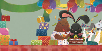
And the second book is Cici's Birthday, its a book where you can teach children to do math in fun way, so there a column where you can fill the answer.


Cover 02 sample


Inside book with text sample


Inside preview without text

The book made with thick artcartoon but not dangerous for children, text is very easy and fun to read (and to be honest I play with the fun with Math book too) its really nice book that I even recommended to buy it.

So get it soon while still in bookstores :D


Sunday, February 8, 2015

Things Magazine competition

Another competition that i joined for this year (whew thats a lot....), but this one I didn't win tho. Which is fine because I myself considered that this art lack of good concept, I bet there more artist who prepared more than me (I saw one of my favorite entry among the winner, he/she deserved it ^^).
Anyway I will do better next time.


(click for larger image)

The bad thing....like I wrote before in my twitter, I lost my original PSD for this picture. Files been messy in my computer in this recent days, so when I decided to fixed it I just realized later that the PSD file is gone without I even notice when I did deleted it....orz.
My friend gave me one software to fix it, hopefully it can *crossfinger* 

Wednesday, February 4, 2015

Movie Poster competition

I entered local movie poster competition that held by MuviSpot, and ended at 4th place. There a lot of things dissapointing during this competition but whatever the result is, I'm pretty glad for the result especially Slumdog Millionaire version.


(click for larger image)

I decided to choose Slumdog Millionaire because i found the official poster is a bit dissapointing, they didn't even put the main cast name on it, how shameful...
I put the chair as main object because the theme on this movie even romance is the game called Who want to be Millionaire, the game that decided of main character ending. I like how this movie actually about romance but they made it didn't look like your usual romance flick, and I love everything about it, not to mention the cast and the place take in India, which is why i used Indian look for this poster, the style or pattern.

And the second poster didn't win anything, but because I made it when I really in love with the movie, I just posted here too...


(click for larger image)

God, I'm so in love with the movie. Its heavy movie, a lot of dialogues and some disturbing idea but interesting especially we get to know the love story between sentient Operating System and human, which ironically I think this can happen in future.
I used White Carnation for the symbolic "Pure Love" because its the thing that I can see between the main character and one OS called "Samantha", the computer things made me decide to pixelate the flower, and made the title "Her" using random binary code, to add "tech feel" to this poster.

I just like simple poster but tell everything, like one of my favorite movie poster remake Olly Moss.